the mileage & gas receipts database

screen shot

Free! That ought to get your attention. This is a modern solution to an age old problem.

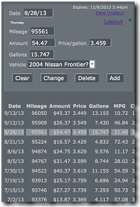
The Mileage and Gas Receipt database helps you keep track of all your gas receipt expenses and business mileage. Gas receipt information includes miles per gallon. In addition to being useful information, it can help you identify missing receipts. Mileage information includes a percent used for business, a number some people use for tax purposes.

This service is available to any device connected to the Internet. Nothing to download, nothing to sign up for. It is simply a web site. Using a mobile device to record gas receipts and mileage provides a convenient tool for handling a necessary, but otherwise nuisance task. Having computer access to that same information, makes emailing, printing or otherwise preparing your information that much easier.

Getting Started

You'll need a Google account to use this service. Google provides a great deal of security and support. I couldn't provide this level of protection without them. Sign up for a Google account here if you need one.

Grab your receipts and head to your future home for Mileage & Gas Receipts.

Additional Help

In the Mileage app, the Ending Mileage field, you can say '+13' to add 13 miles to the Starting Mileage.

Your 'home' button is your user name link in the upper right corner.

Technical Background

A project goal is to work on any Internet connected device, and to run on any Internet connected server. Towards that end I use basic and common tools, and rely on HTML5 to provide the universal platform.

Starting on the backend, the data is stored in a MySQL database. PHP is the development language on the server. Authorization is done using the Google APIs, which use OAuth 2.0 for both authentication and authorization. There is essentially one program (one Object) through which all database connectivity is funneled.

On the front end is HTML5, CSS and Javascript. Ajax programming techniques provide for a fluid exchange of data between the server and the client. JSON is used rather than XML, as is often the case.

My object oriented programming skills improved greatly. After building the application, I realized many mistakes I had made, and opportunities I had missed. Piece by piece, I rewrote the entire system many times. Most aspects of this application are now object oriented. The remaining procedural block is the routine to produce output.
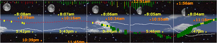


active weather chartsfishing chart screen shot

What started as the Spider Lake fishing chart is now a general purpose weather tool. Providing a unique view of weather since 2007. Want to see your favorite spot? Send a note to dave at info-tran dot com


there's more than meets the eyeAlta Mountain Lift

The old adage "A picture is worth a thousand words", didn't take digital cameras into account. We're talking millions.

Recently, I got an email with some rather large pictures attached. I wanted to see just how much information was actually in those pictures. When I looked at the picture full size, I only saw a small portion of it on my screen. To demonstrate the depth of information in the picture, I've set up the display below.

Just click The Button (to the right side of the large picture) to see how much information there really is in your digital pictures. It might take a few seconds for the pictures to load the first time through, but it should be very responsive after that. You can also click on the image rather than the button.

1

Neat, eh? Now, use your imagination a bit. Imagine the distant rattle and hum of a chair lift. As you click through each picture, the hum gets a little louder. And just as you click to the last picture, clankity clank, clank, clank, the chair goes over the tower.

Alta Mountain

Here's another picture, this time with a landscape view to fill out your screen a bit more. No button this time, just click the image to change to the next. Remember, it might be a little slow the first time through.

the Utah Snow report

fishing chart screen shot

The snow reports have been shut down, at least for the season. There was little or no participation data, so I was unable to show snow storms. Back to the drawing board on that one. The links are active, you are positioned to the day the weather station was shut off.

What does bass fishing have in common with downhill skiing? Well, this page anyway. After seeing the trends produced by the Spider Lake fishing chart I got to thinking it would be nice to be able to see how much snow a resort gets. Well, this year's Add a Man ski trip is to Utah, so I thought I'd check it out.

I set up charts based on weather data from stations at Alta's Rustler Lodge and North Fork Park in Eden, Utah. Both charts share celestial data based on a location in North Salt Lake that identifies the home of a man living under a highway overpass, right next to a pair of railroad tracks. Go ahead, take a look, Flash Earth is pretty cool. It's actually a point in his front yard.

While the charts look the same as the original fishing chart, it completely different under the covers. This project was my first attempt at object oriented programming. I have tried several times in the past to learn OOP, but I just didn't get it. This time the light bulb finally lit (actually a couple, three times), and now I get it. I'm still not very good at it, but at least I'm starting to think differently.

The other thing I've come to realize is that the Document Object Model (DOM) is the center of all things browser related. HTML talks to CSS via DOM, and the whole Web 2.0 thing is made possible because of the Document Object Model. So I'm bypassing HTML all together and building my own custom DOM controls and displays using JavaScript. If you look at the HTML source, there is very little to see, but use a DOM Inspector, and it's all there. The result is much more consistent than I could do in HTML.

Plus, I can do it on the fly. That's where the dynamic part comes in. The page first loads the controls and an empty chart, with the word 'Loading...' showing in the current date and time field. Meanwhile, the data is being loaded. Once complete, the data is drawn on the chart. And then of course, all of the user interaction is dynamic. This is a click happy kind of page, click fast to see time flash before your eyes.

My breakthrough came in finding this wonderful tutorial on the object oriented thought process. It was language agnostic, concept oriented, and didn't use 'foo bar' in any of its examples. I took notes, on paper, just like I was sitting in class 30 years ago. I needed the discipline. I learned some good practices and techniques. The Unified Modeling Language provides a graphic modeling tool that applies to any language, plus a whole lot more.

Then reality reared its ugly head. Ya see, JavaScript is only kinda, sorta an object oriented language. I had to learn what prototypal inheritance was. An already complex thought process now needed to be translated to the real world. And when I finally thought I was ready to begin the project, I stared at a blank page for four days. Not a thing for four days. I'd go back and read a little, then study a little more. Nothing. Not a clue.

Once I finally got started, progress was slow. Eventually, I had a couple of spurts of activity, but I never really became productive. Every step of the way, I'd have to go learn how something worked. How do I build a DOM object? How do I use XMLHttpRequest to communicate with the database? And what's the best way to return the data to JavaScript? I know I've made some mistakes, but the nature of objects is that they lend themselves to refinement over time, and I'm good at that. Reading this sounds like I've been through hell, but I've had a ball. Once I get it working just the way I like it, it's all worth it.

Once again, here the link's to:

Alta's Rustler Lodge snow chart
Powder Mountain snow chart

Please stop by the forum and let me know what you think.

the Spider Lake fishing chart

fishing chart screen shot

I really don't expect anybody to read this, so jump to the Spider Lake fishing chart right now and come back here if you have any questions.

When's a good time to go fishing? That's the question that started this project. People tend to fish at sunrise and sunset. That seems to be a good time to fish. 'Wind from the east, fishing is least, wind from the west, fishing is best', that's what the old timer says. I tend to believe that too. How about the moon? People at the ocean tend to fish around high tide. The moon is at it highest point overhead (or directly under) at high tide. You know you are out of the city when the local weather forecast includes the sports mans calendar showing the peak times to fish and hunt tomorrow. Both the sun and the moon factor into this prediction.

Another thing to consider is barometric pressure. The barometer at our cottage has two areas identified as good fishing zones. It has a cute saying I can't remember that basically says, a rising barometer is great and a falling barometer is not bad. It's the periods of steady barometer readings that are poor fishing zones. Fishing just before a storm, or just after a storm, will be the best times to fish

So now let's start to collect the data we need for this project. The US Navy is a good source for the celestial data we need. Providing the latitude and longitude coordinates of Spider Lake gave me information that look like it came from a mainframe computer. Here is the Sun and Moon charts that I started with. To figure out what is going on today involves scanning over the columns to find the right month and then scrolling down to find the right day. Now hold your finger on that spot while you look up the same information on the other chart.

This information needs to be transformed!

The first things was to get all of the rise and set information into a database. Now I can look up today and see sun and moon information together, organized correctly. Using a picture of a blue sky with clouds to represent day and a picture of stars to represent night, day and night become more visible. The moon is on a 29 day cycle with phases ranging from new moon to full moon. Showing the moon phase at the time of transit (the highest point of the sky) provide a wealth of information with reduced clutter. It also makes very apparent that the moon is an hour later every day. The visual presentation adds value to the information.

The information has been transformed!

Now for the weather data. I found a weather station nearby, KMITRAVE3 JD Stratton Electric, Inc, Traverse City, MI. This site provides a daily XML feed of weather data. There is actually an observation taken every 5 minutes, and each observation has almost 50 pieces of information. I'm keeping track of 1 reading per hour with just a handful of data in the database. I can plot weather data on top of celestial data and store it over time. My first revelation was how much relative humidity fluctuated.

The 'rules' identified above can now be applied to the weather data that is displayed.

  • wind legend pictureThe wind speed is shown by the length of the bar. If the wind is from the west, the bar is green. If the wind is from the east, the bar is red. In between, it turns yellow, but only briefly.
  •  
  • barometer legend picture The barometer is a bit more difficult, working on a point system. If the reading is in either of the good fishing zones, it's worth a point, if the barometer is down from an hour ago, points are awarded for the difference. If it is down from 2 hours ago, even more points are awarded. If the barometer is up, the same rules apply and that number is doubled. You see the result of that plotted for the barometer reading.
  •  
  • Red means the barometer isn't doing much. Fishing is poor, yellow is a little better, could be the start of a good fishing period. Green identifies the best times to fish. The size of the green dot grows as the best times to fish occur.
  •  
  • If it looks too good to be true, it probably is. Could be a malfunction of the weather station. Or the info-tran database could be providing unexpected data.
sample good fishing barometer
Barometer shows good fishing. Too bad it's the middle of winter.

In case you read all this without looking here's a link to the Spider Lake fishing chart


Seldom does true innovation come along. Let alone innovation that significantly enhances productivity. Inspired by the touch interface of today's mobile devices, time pad allows you to select a beginning and ending time in one drag motion. Or two clicks, if your so inclined. Either way, it beats clicking all those arrows.

Think about the appointments you make, time sheets you submit, meetings you schedule, reservations you request. To enter a starting and ending time requires several clicks by the time you're done. With time pad, you do that in one mouse drag. Multiply that efficiency times corporate America, and we're talking some significant savings.

time pad represents a new software component popularized by widgets. Graft time pad on to an existing system and you'll realize immediate benefits. Design a new system using time pad and really open up the possibilities. For more information contact dave at info-tran dot com

what's next?

This is nothing more than a proof of concept. It visually demonstrates an idea I have. Now I'm trying to figure out if anybody would be interested in this, and what else they would like to see it do.

The next thing I would add would be a fish database where I could enter my catches and see them plotted against the weather data. I think there is something to be learned. Anybody who has recorded fish catches realizes the amount of data involved. Having the weather data eliminates some of what needs to be captured.

And I would want to see this information plotted on a good map of the lake. It would be easy to identify regions on a map that outlined local fishing spots. At the very least I could see where I caught the fish. It would be real easy to build in a time of year analysis to see the differences, spring to fall.

Where it gets interesting is when a lake association or other group wants to keep track of a whole bunch of people. It could create a greater sense of community. Showing everybody's information together could be quite impressive. It may even provide data for wildlife management. I know the environment on Spider Lake has changed over the years. This information could help to measure the effect of planted fish.

What I need now is a digital camera that captures date/time and a gps location along with the picture. If I can capture the weight of the fish in the picture, I can take this to the Pro Bass fishing tour.

Please stop by the forum and share your ideas.